Less form fatigue
The flow asks for the next useful input, not everything at once. Buyers keep moving without hitting a wall of fields.
GoFastrr keeps checkout calm: verified buyers, remembered context, cleaner offer logic, and Indian payment paths arranged to finish.
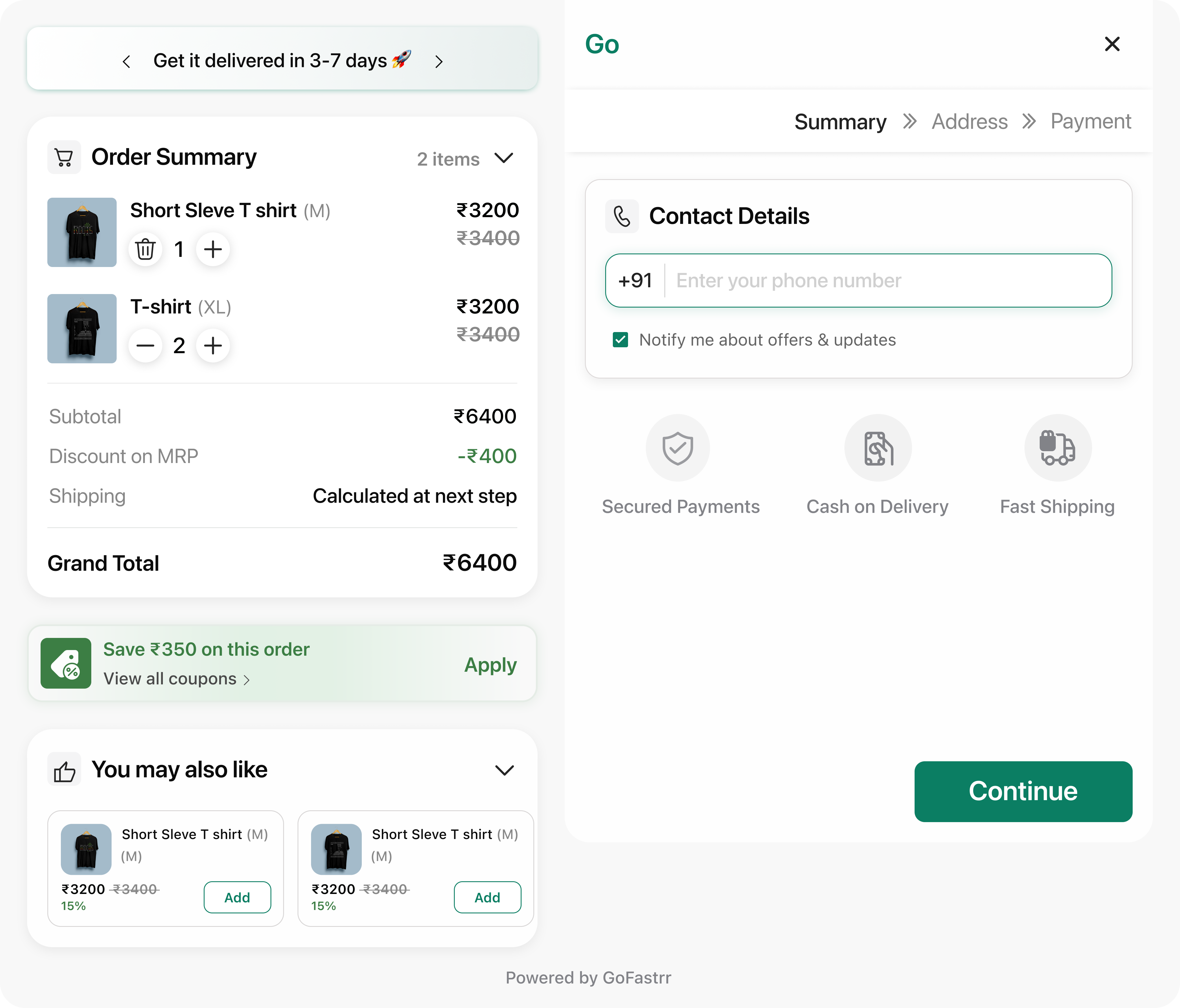
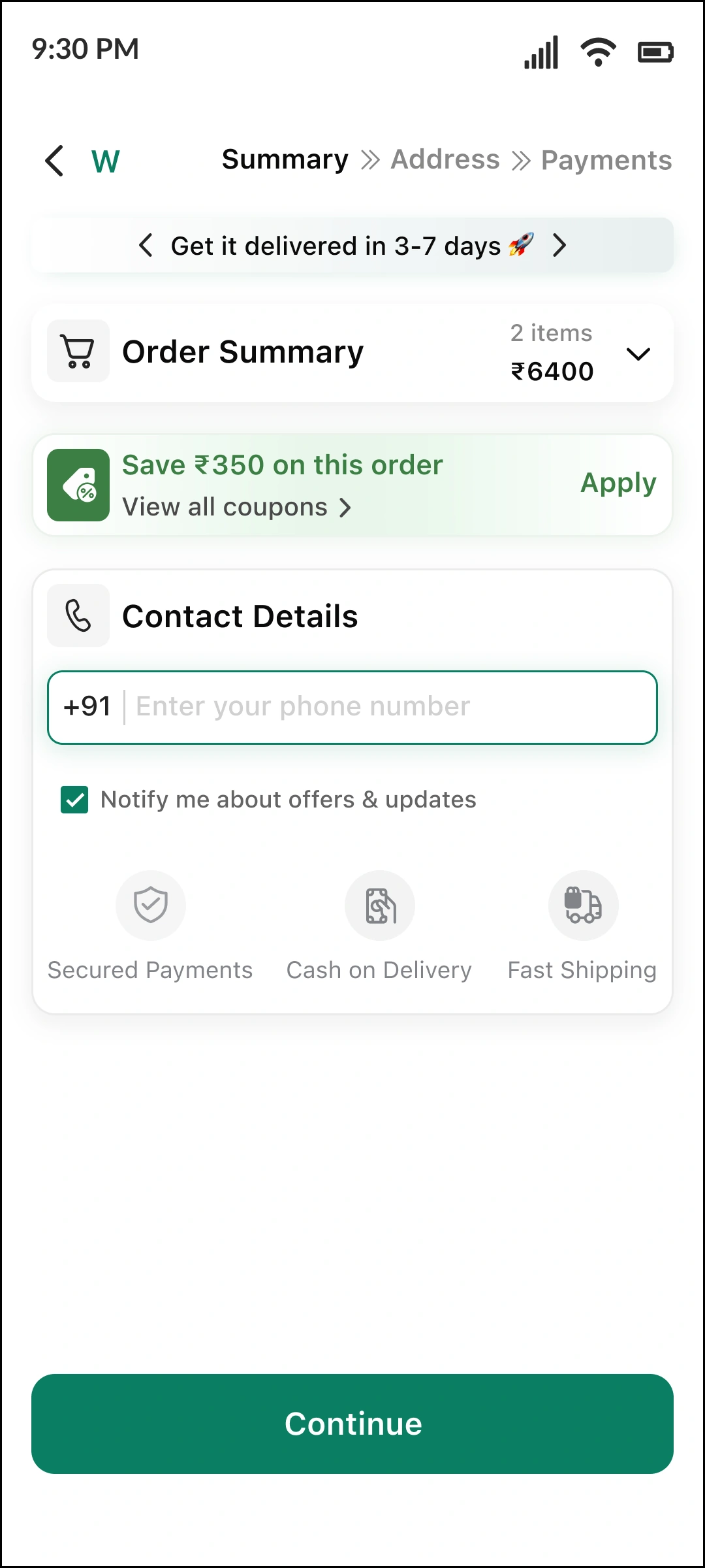
GoFastrr is arranged so buyers stay oriented, teams keep control, and the final step never turns into visual noise.
The flow asks for the next useful input, not everything at once. Buyers keep moving without hitting a wall of fields.
OTP verification happens before fulfilment logic gets heavy, improving order quality without making the brand feel defensive.
Coupons and nudges appear where they help the decision instead of hijacking it. The basket stays clear and buyer intent stays intact.
UPI, cards, COD, wallets, EMI, BNPL, and partial payment stay accessible without turning the finish into clutter.
Scroll through the sequence exactly as a buyer experiences it, from first input to final payment, with each state showing how intent is protected along the way.
The buyer enters a phone number and nothing more. That matters. The page does not ask for address, payment, coupon, and shipping context before the buyer is ready. It feels focused immediately, which is exactly what premium digital experiences do well.
A strong checkout does not separate trust from elegance. OTP verification here supports order quality while preserving momentum. The experience reads as product quality, not operational friction.
Returning buyers should not pay the same friction tax every time. The address state shows memory, which reduces cognitive load, shortens time to payment, and reinforces the sense that the brand knows them.
Not every buyer is returning. A premium checkout still has to handle first-time capture beautifully. This state keeps the form controlled, understandable, and easy to move through, which protects completion for net-new demand.
This is one of the most important shifts in tone. Offers live inside the experience as controlled logic, not as noisy discount clutter. Buyers understand what is available, what is not, and why.
The final screen holds the hardest tension in Indian checkout: many payment behaviours, one decisive finish. GoFastrr keeps the surface broad, recognisable, and controlled, so the last action still feels obvious.
Contact, OTP, address, saved context, coupons, and payment stay in the same order on larger screens.
The desktop journey opens with the same low-friction phone field, keeping the first action light.
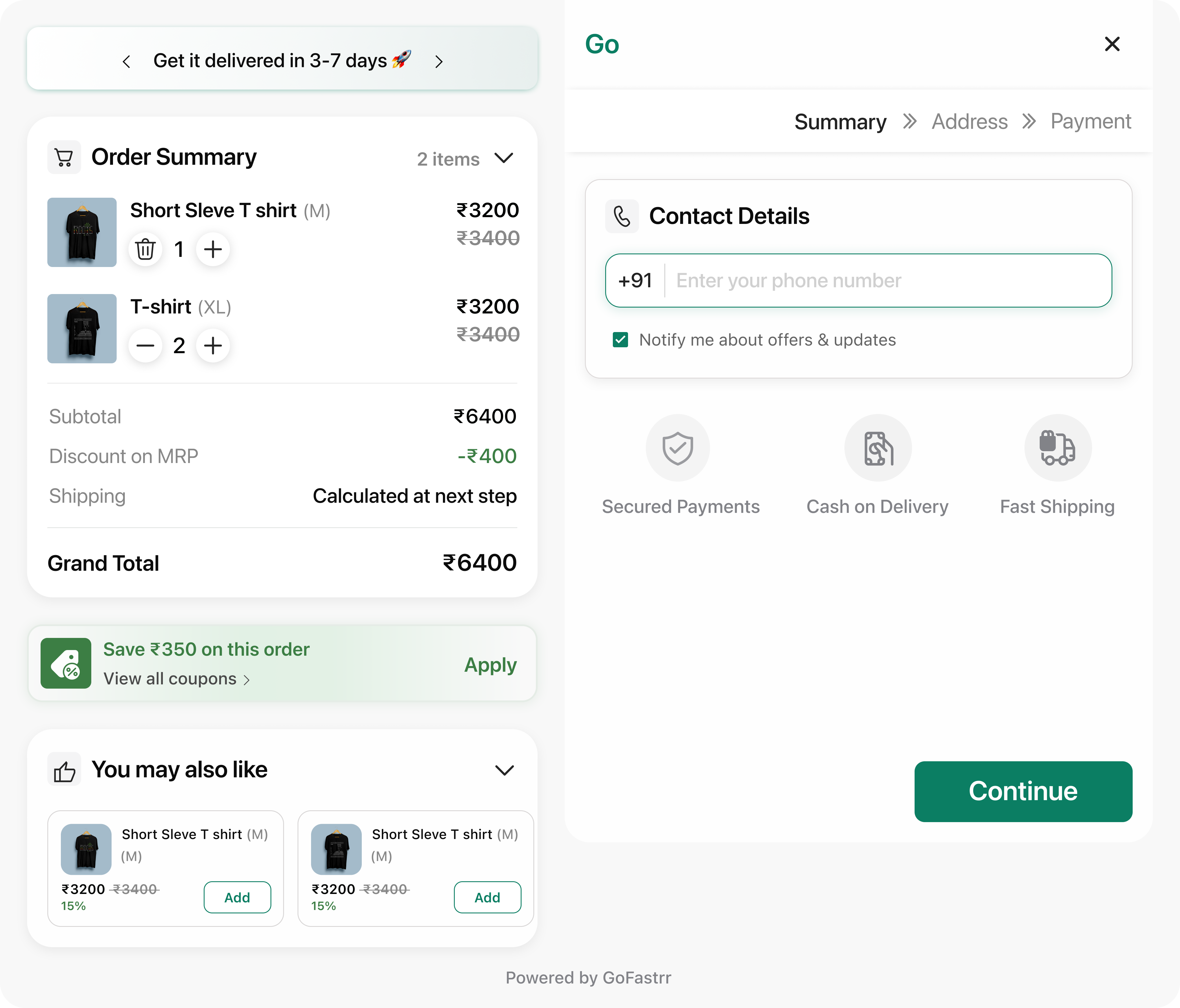
A premium checkout has to do more than look good. It needs to improve order quality, protect margin, and keep commercial control inside one coherent layer.
Phone capture and OTP verification create a higher-signal order funnel before logistics, shipping, or fulfilment cost is committed.
Promotions can be surfaced with eligibility logic and order awareness, instead of turning checkout into a confused discount playground.
Shipping rates, COD behaviour, and payment presentation belong to one controlled layer so the funnel does not feel stitched together.
Buyer identity, offer logic, and payment choice live inside one measured flow, making it easier to understand where performance improves and where optimisation should happen next.
As order quality, conversion, and fulfilment efficiency improve, the product gives brands a clean path into case studies, testimonials, and measurable commercial outcomes.
Mobile, desktop, saved-buyer state, first-time address entry, coupons, and payment all sit inside the same tone of voice and design system.
GoFastrr is positioned as a checkout layer that can be installed, configured, and refined without sacrificing brand tone at launch.
Start inside your Shopify flow instead of forcing buyers into a disconnected external experience.
Bring the commercial rules together in one system so checkout feels coherent from first input to final payment.
Start with a buyer journey that already feels premium, then add proof, reporting, and deeper operational surfaces as the system evolves.
These are the questions serious brands ask before they change the last step of the funnel.
No. The product is positioned here as the checkout layer around the payment event: identity capture, saved buyer context, offer logic, shipping control, and payment presentation.
Yes. The payment state is designed to keep UPI, cards, wallets, EMI, BNPL, and related logic visible without letting the last decision collapse into clutter.
No. GoFastrr operates as an external checkout layer outside Shopify's native checkout which means Shopify's transaction fees don't apply. You keep the margin you earned.
Yes, you can still use it.
Give buyers a checkout that feels faster, calmer, and more assured from the first digit to the final payment choice.